Disclaimer
Prices, promotions and incentives are subject to change without notice. The developer reserves the right to make changes and modifications to the information contained herein without prior notice. Dimensions, sizes, areas, layouts, specifications, features and materials are approximate only and subject to change without notice. Any illustrations, renderings and photographs are for illustrative purposes only and may not be accurate. E.&O.E.
Stay in the Loop


Register Your Interest
Stay connected to receive news, events and updates about kʷasən Village. We look forward to sharing more of our story with you in the coming months.
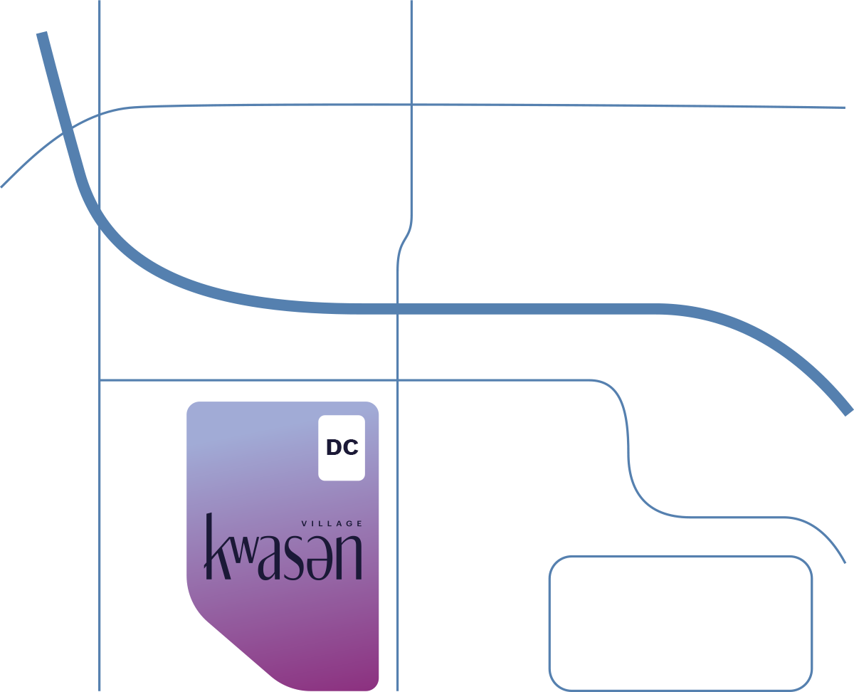
Discovery Centre
3405 Willingdon Ave Burnaby, BC V5G 3H4
Open Daily
12pm-5pm
(Closed Fridays)
12pm-5pm
(Closed Fridays)
Prices, promotions and incentives are subject to change without notice. The developer reserves the right to make changes and modifications to the information contained herein without prior notice. Dimensions, sizes, areas, layouts, specifications, features and materials are approximate only and subject to change without notice. Any illustrations, renderings and photographs are for illustrative purposes only and may not be accurate. E.&O.E.